Welcome!
I'm a UX lead and digital strategist. I help organizations turn complexity into coherent, high-performing digital experiences, from early vision and stakeholder alignment to execution.

What I do
From campaigns to redesigns to 0 → 1 initiatives, my strength lies in moving fluidly between system and detail. I step into ambiguity, establish clarity, and align stakeholders around a shared experience direction. From there, I guide cross-functional teams in executing against that strategy.
B2B
B2C
B2B2C
DTC
Websites
TV Interfaces
Kiosks
apps
Dashboards
consoles
Campaigns
eComm
B2B B2C B2B2C DTC Websites TV Interfaces Kiosks apps Dashboards consoles Campaigns eComm
How I Work
After 20+ years and 40+ organizations, spanning industries, business models, platforms, and project types, I’ve developed a structured but flexible approach that I customize for each initiative.
-
To build a foundational knowledge base for myself and future teammates, I examine what I call the Four Cs.
Company = brand, products, services, objectives, experiences
Customers = audiences, needs, pain-points, desires, jobs-to-be-done
Category = competition, industry landscape, culture
Context = timing, constraints, capabilities
-
To help align stakeholders around a shared experience direction, I distill complexity into a clear strategic approach and vision. This could come in the form of visioning presentations, customer journeys, and prototypes.
-
To help cross-functional teams plan and execute, I create clear guidance in the form of service blueprints, ecosystem maps, site maps, content strategy, measurement plans, and roadmaps.
-
To ensure the design of well thought out, high-impact experiences, I onboard multi-discipline teams, and guide them through design, content, and testing.
How I got here
My versatility comes from the environments and people I’ve been fortunate to work with. Across agency and product projects, I’ve been exposed to different industries, team structures, and ways of solving problems, while learning from mentors and teammates I deeply admired. Over time, I adopted the approaches that worked best and integrated them into my own practice.
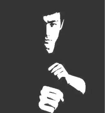
“Absorb what is useful, discard what is useless, and add what is specifically your own.”
— Bruce Lee
Lessons I’ve learned
-
Even the most experienced professionals have blind spots.
The best work happens when more perspectives are included, which is why I regularly seek insight from customers, teammates at every level, and the work of others who’ve solved similar problems.
-
I value working with good people above all.
Respect, kindness, and chemistry create space for open communication, honest feedback, and collaboration that feels effortless and produces the best work.
-
AI is a powerful tool, but tools alone don’t guarantee good outcomes.
If you handed me a violin, the result would sound very different than if you handed it to a professional musician. The instrument is the same, but experience shapes what’s possible. Working with AI is similar: knowing what to ask, how to guide it, and how to evaluate the results makes the difference.